Crema

Overview
Process

What is Horizon?
Horizon is a product management tool in early development by Crema. The purpose of Horizon is to provide a platform where product managers can track progress, and both designers and developers can collaborate.
Design Process Overview
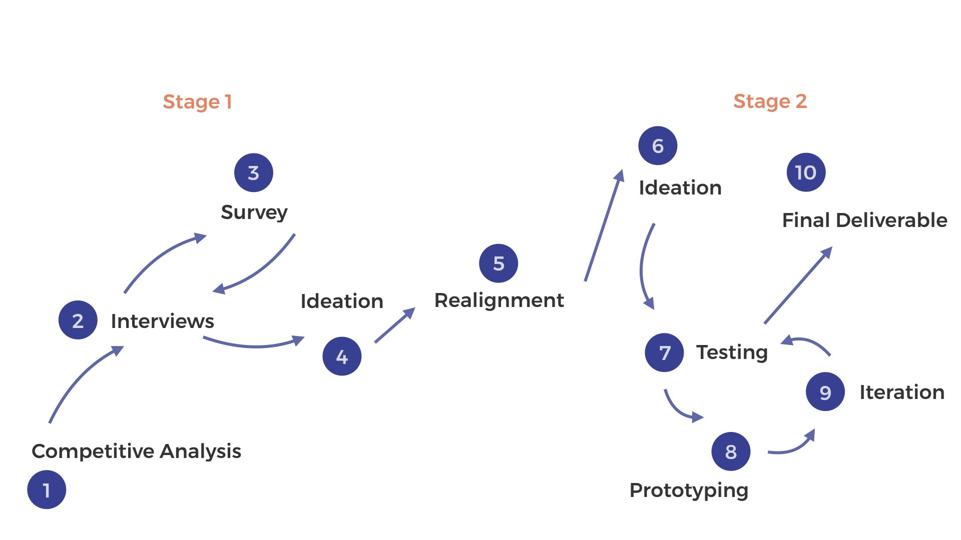
User Research
Competitive Analysis
Goal
We analyzed 10 different tools to better acquaint ourselves with other product management tools and what they have to offer
Takeaways
- Organization: Tools use clean design and color coordination to present task-tracking data
- Onboarding: Many tools use various methods to onboard new users. Popular methods include introduction videos and five-swipe tutorials
- Communication: Tools provide unique ways for diverse teams to communicate with each other, such as making posts and responding within a group
- Collaboration: Tools allow team teamwork via in-app collaboration or file sharing
Interviews
Goal
We interviewed 8 product managers between the ages of 22 and 27. We aimed to better understand what product managers look for in a management tool. We also wanted to recognize certain pain points that users experience
Takeaways
- Top 5 desirable product management features are communication, accessibility, real-estate, live interaction, and color differentiation
- Some product managers and their teams use product management tools that incorporate development or design features
- Product managers often use several different applications throughout their workday
- We recognized certain pain points, such as how product management tools tend to cater to product managers and overlook designers or developers
- There is a large difference between product and project management software. We identify that we are strictly focusing on product management tools
“Throughout the day, I find myself using 20+ different applications for communication and management.”
- 23, Product Manager
“Diagrams are only a snapshot. We want to visualize the big picture.”
- George, Our Sponsor
Survey
Goal
We wanted to learn more about the preferences in tools and functions among product managers
Takeaways
- 13 people took our survey who each had product or project management experience
- The tool that was most commonly used by product managers is JIRA
- The features that are most useful when being introduced to the software as a new product manager are Onboarding, Communication, and Collaboration
Persona

Phoebe Walker
35, Senior Product Manager, Works at Crema
“I need a PM tool that is easy to use, so new team-members can quickly learn how to use it.”
Ideation
The method we used to sketch and ideate is a carousel sketching activity. Carousel sketching is a group activity that allows a team to ideate around one aspect or feature of a prototype. Each team member builds upon what previous members have sketched
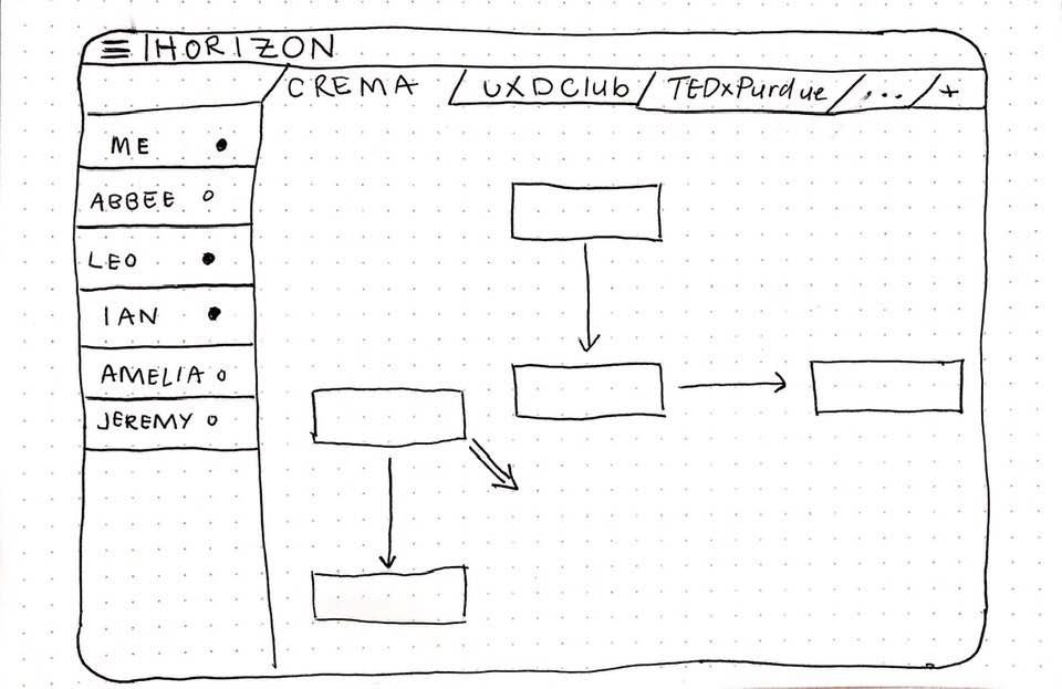
Roles & Teams
Distinguishes how teams and their members are organized within the layout.
All of the teams that the user is a part of will be displayed at the top of the screen.
Every member of the team that is currently open are displayed on the left.
The dots next to names indicate whether the team member is online and available to chat.
Members can make parts of the flow and then add it to the team’s overall flow.
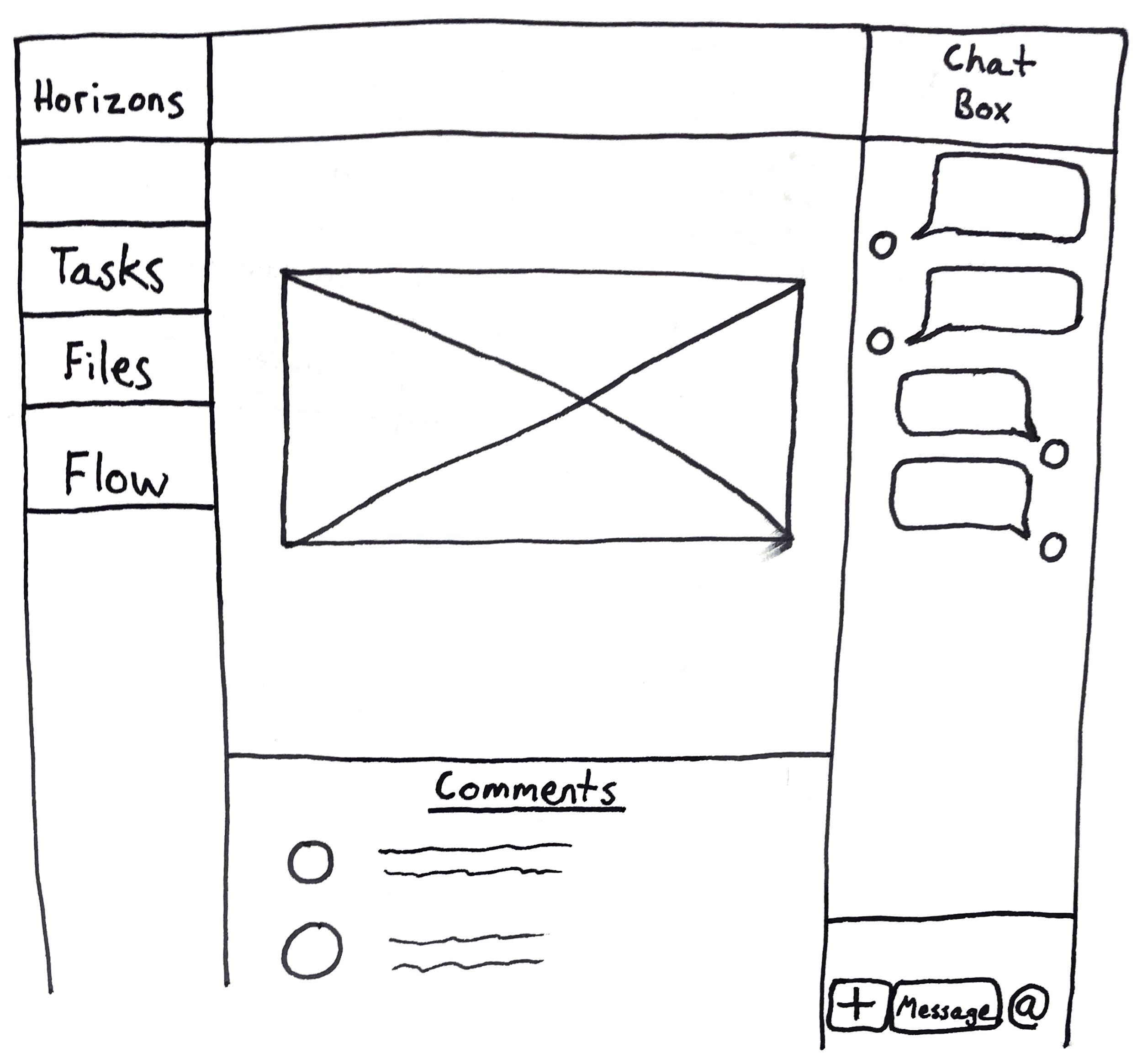
Collaboration
Collaboration provides capabilities that allow users to work together on a certain aspect of a project.
This right-hand sidebar is a designated area where the user can fully communicate with the other members of the project.
At the bottom section of each page, there is a comment section where users can notify other users about information related to this specific page.
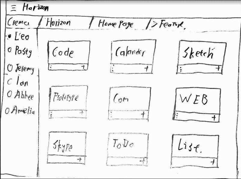
Features
This screen presents how many different plugins that the user can install for Horizon. The user can customize the features they would like to see and use for the workspace they are in.
The upper bar is used as a guide that displays which page and directory the user is currently in.
Team member availability can be seen on the left-hand sidebar.
Each box within the interface is a feature that users could add to be used to design, develop, and manage their product. This is a feature that we believe will make Horizon truly customizable.
Communication
Communication allows users to freely converse within or outside of a project.
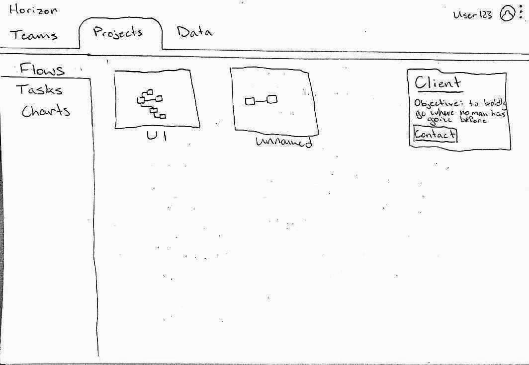
Within the interface, there’s a location to view the Client profile within the project. Clicking would lead to a page with point of contact info and preferred methods of communication.
A pop up would appear if the user chooses to use Horizon’s in-app video calling service. The service allows other “assets” or tabs to be pre-loaded and easily accessed in a screen-share function. The pop up would ask if the user wants to begin the call with or without the “assets.”
Prototyping
After recognizing the insights from our research, our team felt that Showing-not-Telling and User Autonomy, while both very valuable, could not be fully realized simultaneously; any amount of Showing what to do would step on the toes of perfect freedom, but any amount of allowed-exploration would require a gap in Showing.
We decided to create two prototypes that focused on each aspect: the first on Showing-not-Telling and the second on User Autonomy. We wanted to see if either prototype concept was better, or if there was some balance that could be found between the two. The prototypes were designed separately but tested in sequence.
Showing, Not Telling
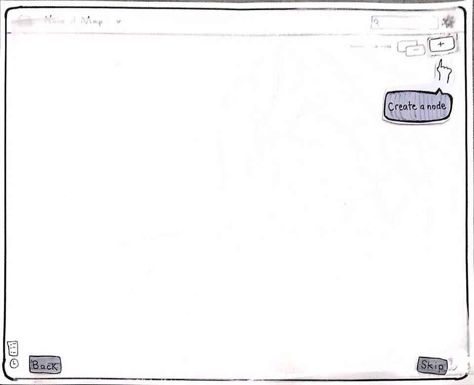
The show-not-tell prototype was created to introduce key features of Horizon to new users. The team established that Nodes were the most important feature of Horizon. We recognized that users would need to understand Nodes, and their properties, in order to use the application to its utmost potential.
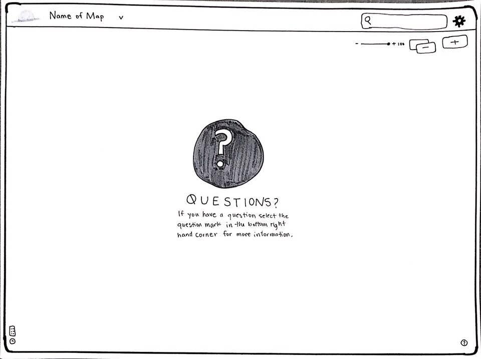
While advancing through the onboarding process, users would learn how to create Nodes and discover the functions they contain. Informational splash screens would be employed so users could be given important information such as where the help button was housed.
Color and shade variations guide the user to follow a path through the app's basic functions.
Tutorials can be accessed again through a search function or reset with the ? button.

User Autonomy
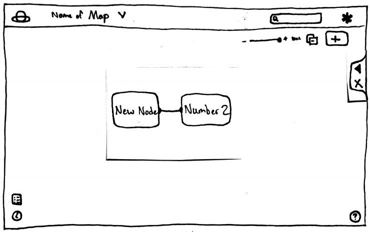
The User Autonomy prototype was designed to allow the user to have complete control over the workspace while providing the necessary instruction on the sidebar. If the user wants to explore and figure out how to do things on their own, the sidebar tutorial can be minimized and later tabbed back in when questions arise. The sets of sidebars could be re-accessed through the help button in the bottom right hand corner.
Sidebar Tutorials allow the user to flip through the information while leaving the main workspace open for exploration and control.
Usability Testing
Goals
- We hope to see if either of our two prototypes are operable by new users and if they contain any usability issues.
- We also hope to see if one of the onboarding methods is more beneficial than the other
Takeaways
- Students with various product and project management experience were able to easily use both tools
- The steps and tasks were clear, but the purpose behind them was not
- Users with no technical experience were unable to comprehend what nodes were and their purpose
- Neither onboarding method was found to be more beneficial than the other
Iterative Prototyping
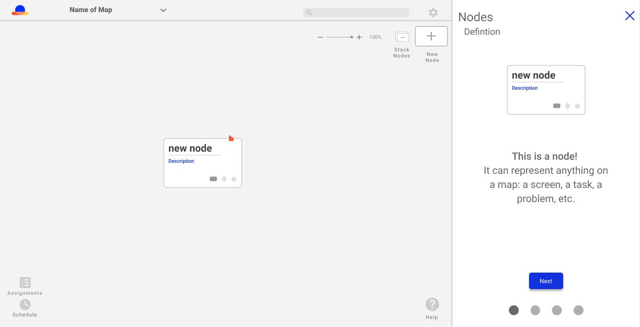
Definition
Once the tutorial is initiated, a four-swipe sidebar appears on the right side of the page to help guide new users. The first screen of the tutorial will inform new users about what a node is. We felt that users needed to understand the concept of a node in order to proceed with the tutorial and use Horizon.
Tutorials can be accessed again through a search function or reset with the ? button.
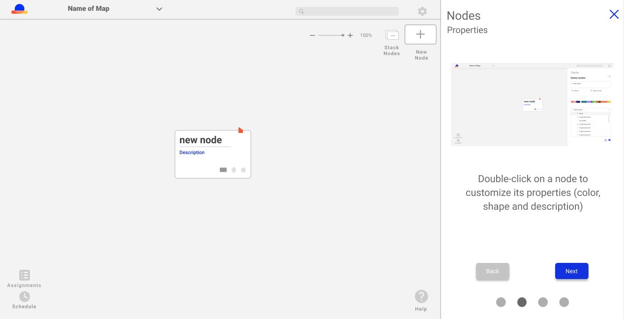
Properties
The user can still interact with the primary interface, while also learning from the tutorial on the right side of the screen. This combines the two ideas we have from the initial prototypes. For example, here the user can attempt to change the properties of their first node, while simultaneously being able to reference the tutorial for direction.
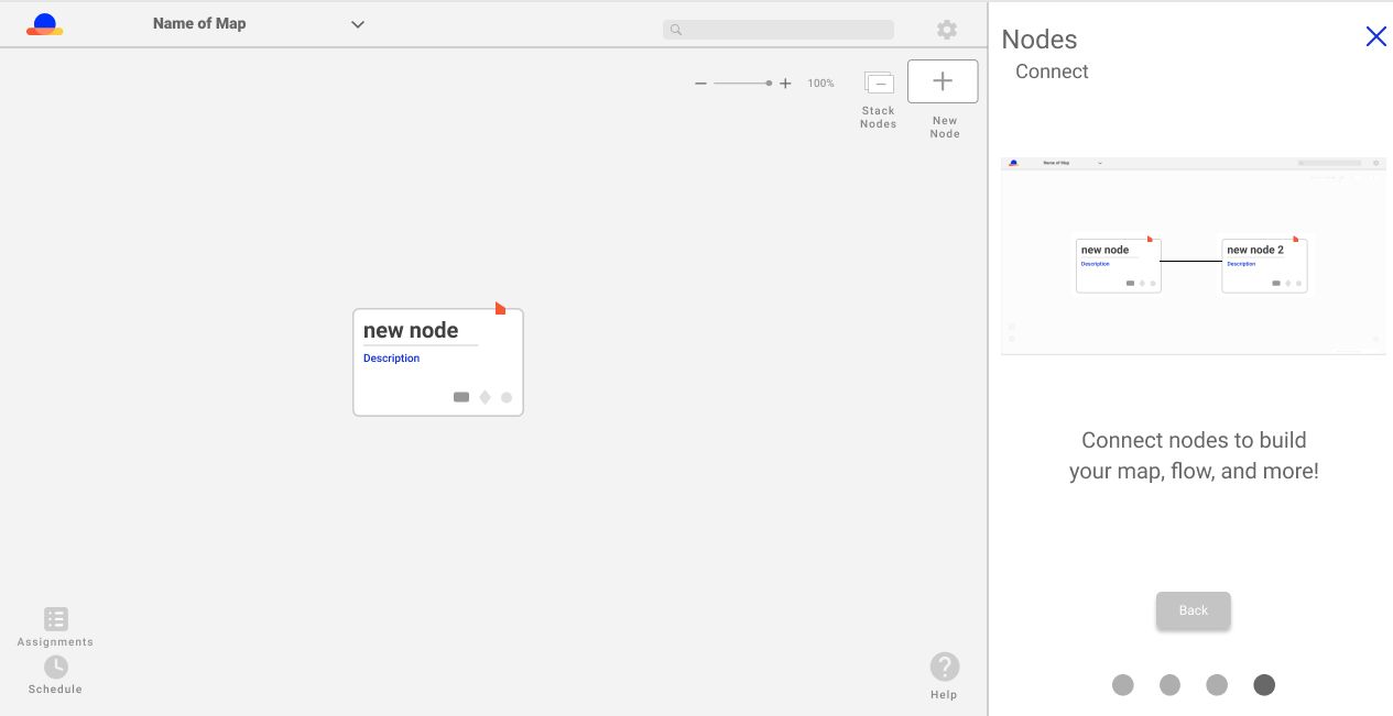
Connect
Each screen within the four-swipe tutorial provides a screenshot of how the interface would look like if the user completed that section of the tutorial. For example, the image in the sidebar tutorial shows users how nodes appear when they are properly connected.
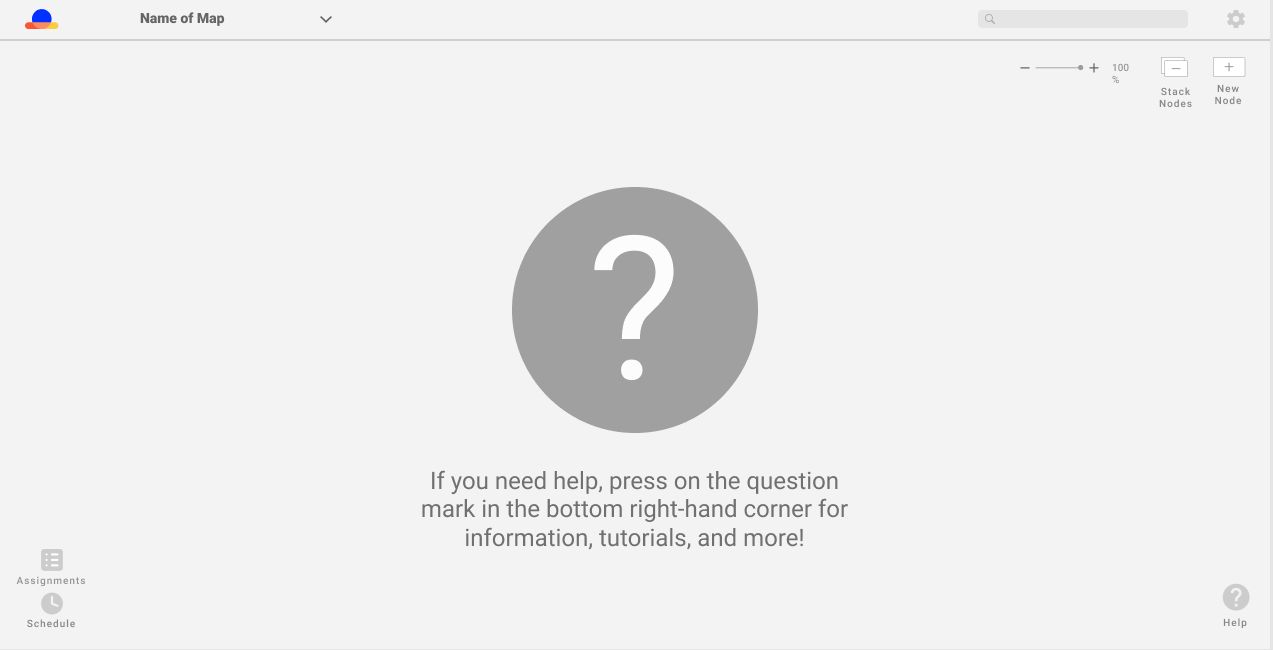
Inform
When the user completes their four-swipe tutorial, they are presented with this brief loading screen. The message informs users that they can always access tutorials and information from the question mark labeled Help at the bottom right-hand corner of the interface.

Help Menu
Once the user clicks on the question mark icon labeled Help, they are presented with this informative menu. Here, the user can access tutorials about every feature within Horizon. If they do not want to scroll through the features, they can use the search option at the top of the menu.
Round 2 Usability Testing
Goal
We hope to see if there are any modifications that need to be made to the prototype before we turn in our final deliverables
Takeaways
- We discovered how people tend to try to avoid selecting the Help button for more information
- Users are still finding difficulty in trying to understand what a node is
- UI and onboarding process is clear and easy to follow
Final Prototype

Summary
In order to acclimate users to Horizon, we created a character named Ray. Ray is a sun who lives on the Horizon, who was designed to be the user's tour guide during the beginning phase of using Horizon. Ray takes the users through the process of creating Nodes, along with other pertinent information related to Nodes. Users watch as Ray creates his own flow within Horizon, while advancing through the sidebar at their own pace. It is a balance of showing users the most important information they need to know in order to use Horizon and the Nodes, while also letting users choose the pace at which they want to learn. Once Ray's tutorial is completed, users have the option to be guided through the process of learning about other features, or leaving the onboarding process.

Emotion
Ray was created to add an emotional aspect to the onboarding process. By personifying Ray, and explaining his backstory, this was intended to make the users sympathetic to the character. The strong emotional bond between the users and Ray that would be created meant that the users would more effectively remember more of what they are being taught through onboarding.
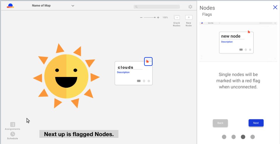
Key Features
Ray only teaches users the key features associated with creating and connecting Nodes. By focusing on teaching and highlighting the key functions of Nodes, users do not feel overwhelmed with information that is not absolutely necessary to creating a more favorable reaction to Horizon.
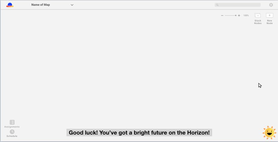
Location
Ray is positioned in the bottom right-hand corner of Horizon after the onboarding is done. Ray replaces the former question mark icon that was housed in the same location and takes over the same function. During testing with the question mark icon, users did not want to use it. Placing Ray their instead, an element that users have an emotional connection with, will help them seek out answers to questions they may have.
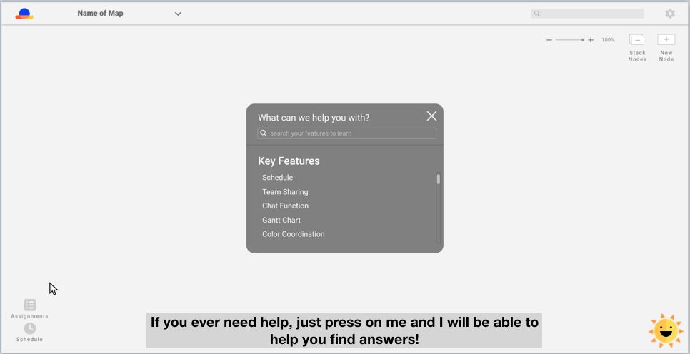
Search
After selecting Ray, users still have the option to search any questions they have about Horizon. Their answers will either be presented by a walkthrough of the feature with Ray, or with an informational guide providing answers and insights. Common questions that are directed to Ray appear at the top of the help search bar to help users articulate their problems.
Onboarding Video
We envisioned that Ray would be presented in the form of an introductory video that would play once the user enters the site and sets up their first project. The video would provide users with all of the vital information that is needed to get started in Horizon.
Reflection
After finalizing our prototype, we ran another usability testing session to see how helpful Ray would be to novice users. Our goal was to observe if the added emotional aspect would help improve the onboarding experience.
Our results were overall ideal. All three of our participants loved the character Ray. They all found Ray interesting and beneficial in the long-term.
Crema can now use our proposed on-boarding model to create a story to introduce users to Horizon in a memorable way, so the users would remember the key features. The model that we presented to Crema is a framework that provides initial introduction to the product management tool and could be applied to other features within Horizon.