Toolkit
Overview
Process
User Research
Interviews
Goal
We needed to understand what the needs of the users are and how they could benefit from using a design toolkit
Takeaways
- Users will reference the design toolkit for two reasons: to explore the methods and build their own workshop
- In-house designers and project managers operate using tablets, so the interface should be designed for tablet-use
- Many of the users are not well-versed in user research or design. The UI should be intuitive and structured for novice designers that want an easy way to build a workshop or learn about methods
Comparable Analysis
Goal
We wanted to see how other reference tools are organized and what their contents consist of
Takeaways
- The book “Design. Think. Make. Break. Repeat” was our primary source for how a design reference guide should be structured
- Reference tools typically include general descriptions, one or more exercises, and a worksheet that would assist with the exercise
- Some reference tools organize the content based on category type, while other tools organize content based on functionality
Ideation

This function allows you to select from a list of templates or make your own template. Here, you can view templates that are designed for interviewing, or you can create your own and use it for later.

While interviewing designers, we talked about their use of Gantt charts. One of our initial sketches included the integration of a timeline from such a chart. This would enable a user to import a schedule from another platform, or create one with which to interview a client.
A feature of design interviews is flexibility, and we wanted that to be reflected in the structure of the agenda

This is an example of how a research method screen could be visualized, such as the persona screen. Users can use the templates to add information about the persona and notes gathered from any corresponding interviews.

This was an idea of how to structure the toolkit. The idea is to segment the structure into three different sections: user research, problem framing, and ideation.

This sketch focuses on how each screen could be visualized. The first screen allows the user to select from the three different sections: problem framing, user research, and ideation.
The second screen on the right shows how each section is further broken down into subsections, which the user can choose between.
The last screen shows how a subsection, such as a research method, could be structured. Each subsection includes a description, a template, and an example exercise that correlates to the method.
.jpg)
This landing page would be the primary screen of the toolkit. The top section is where the onboarding would appear during the first visit to the toolkit. After the first visit, this onboarding section would be replaced by a schedule created by the user. Clicking into each section will display the methods that correspond to that section topic.
.jpg)
After clicking into the User Research section, this is how the research methods would be displayed. The user could create new templates or activities, or access previously saved files.
.jpg)
This Gantt chart would be what replaces the onboarding section at the top of the landing page. Users can view the progress of current projects and add to the project timeline. Each section would be color coordinated to allow for simple interpretation.
.jpg)
This screen shows how users can view a basic description of each method by clicking the method icon. This allows for easy exploration without being forced to bounce from page to page.
.jpg)
If a user enters the Persona screen, this is how the contents will be displayed. A large image of a typical persona would be placed at the top of the screen. This would be followed by a description of the method, an exercise that incorporates the method, and a template document that could be used for the exercise.
.jpg)
This is a redesign of how the landing screen could be structured. Rather than segmenting design phases into sections, this layout focuses on function. For example, if a user wanted to conduct comparative research, they could click within the Compare section.
After clicking into the Stories section, the user would see the different methods that are stored within that category. An example of this is displayed on the second screen.
Prototype
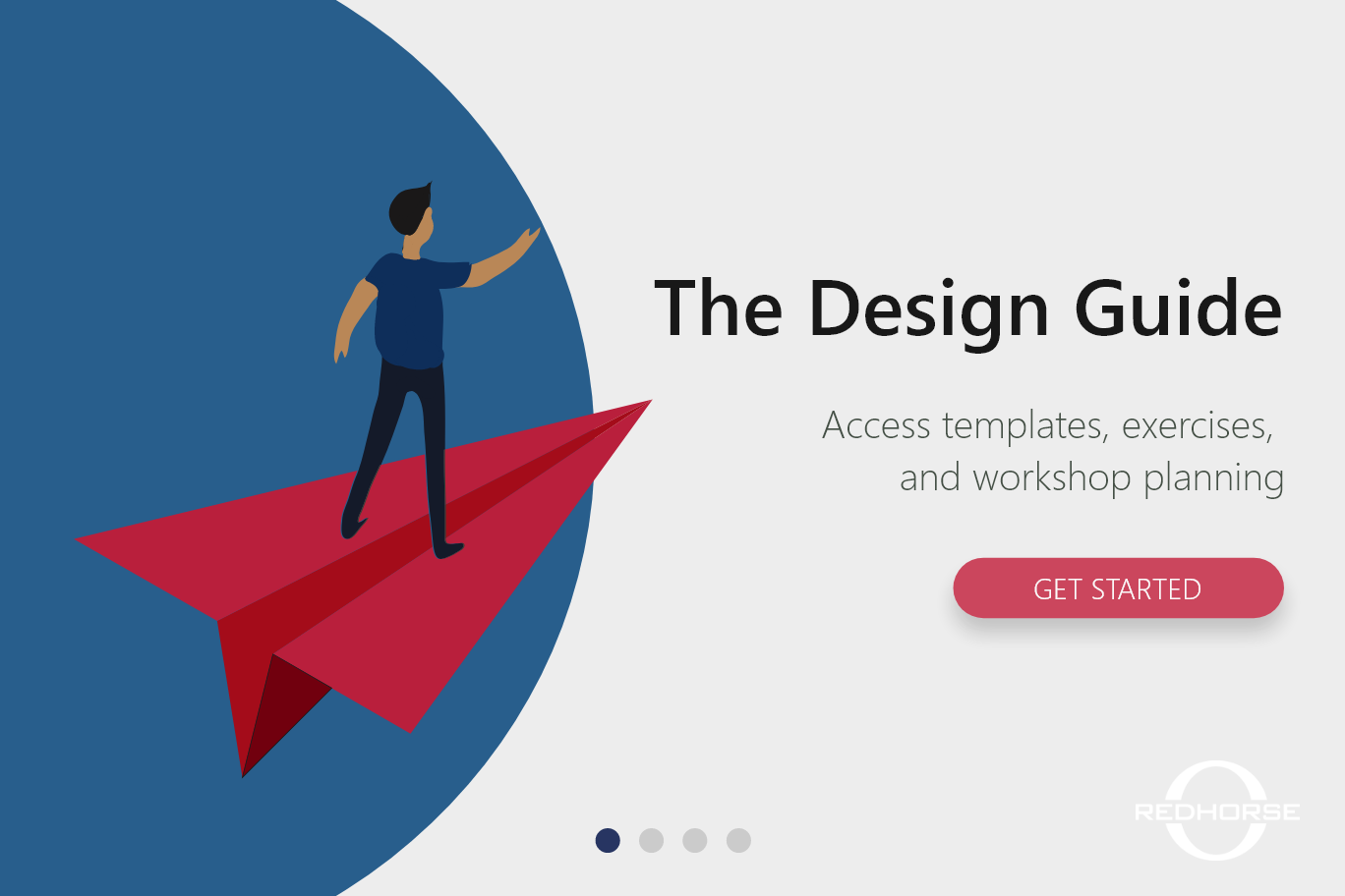
Onboarding
After further iterations, we had realized that an onboarding process would be necessary and beneficial for new users. After creating an account, users would walk through this four-swipe tutorial before entering the toolkit. Each screen provides a brief description of the features of possibilities.
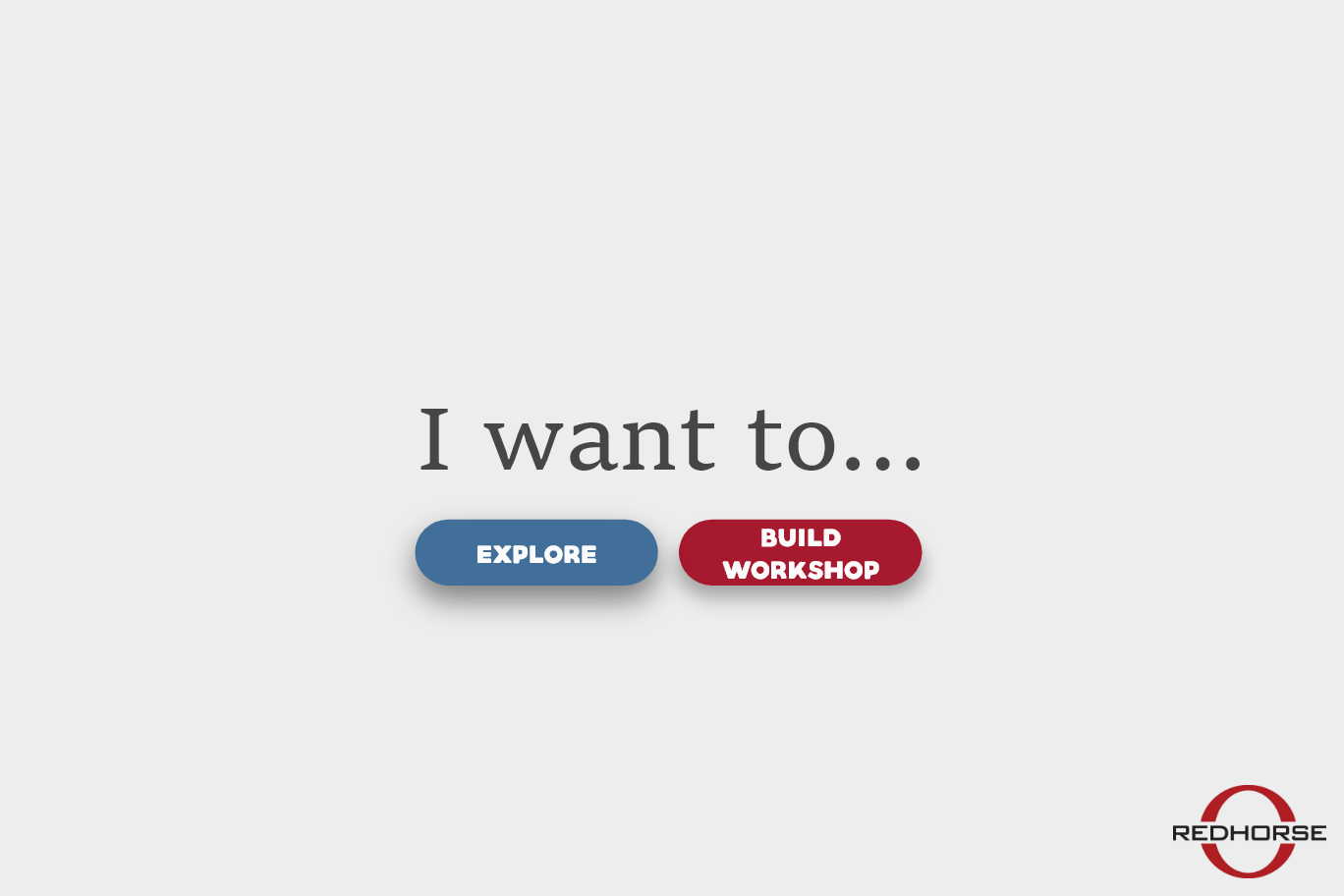
I Want To
The user has the choice between exploring the different methods that are stored within three function-based categories or begin creating their own workshop.
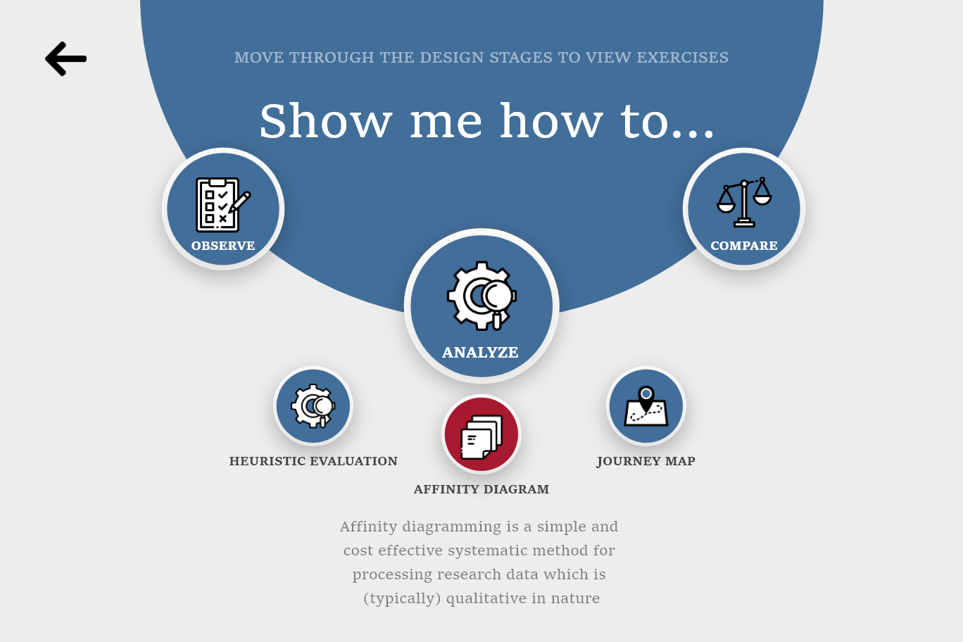
Explore
If a user selects ‘explore’ from the previous screen, they are taken to this screen. Users can swipe through the three separate categories: observe, analyze, and compare. Each category has a list of methods that users choose from. When clicking on a method, a short description is displayed beneath it.
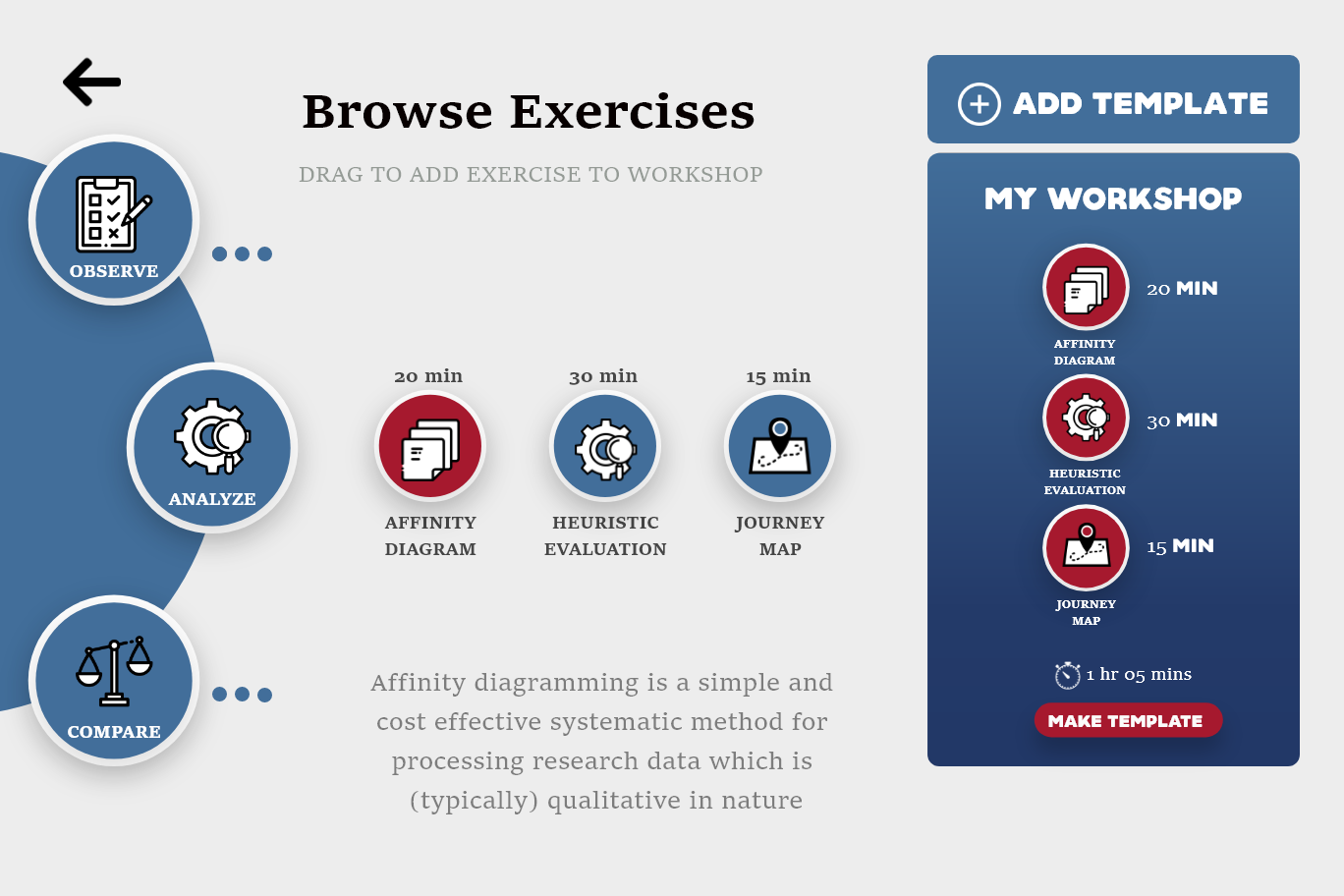
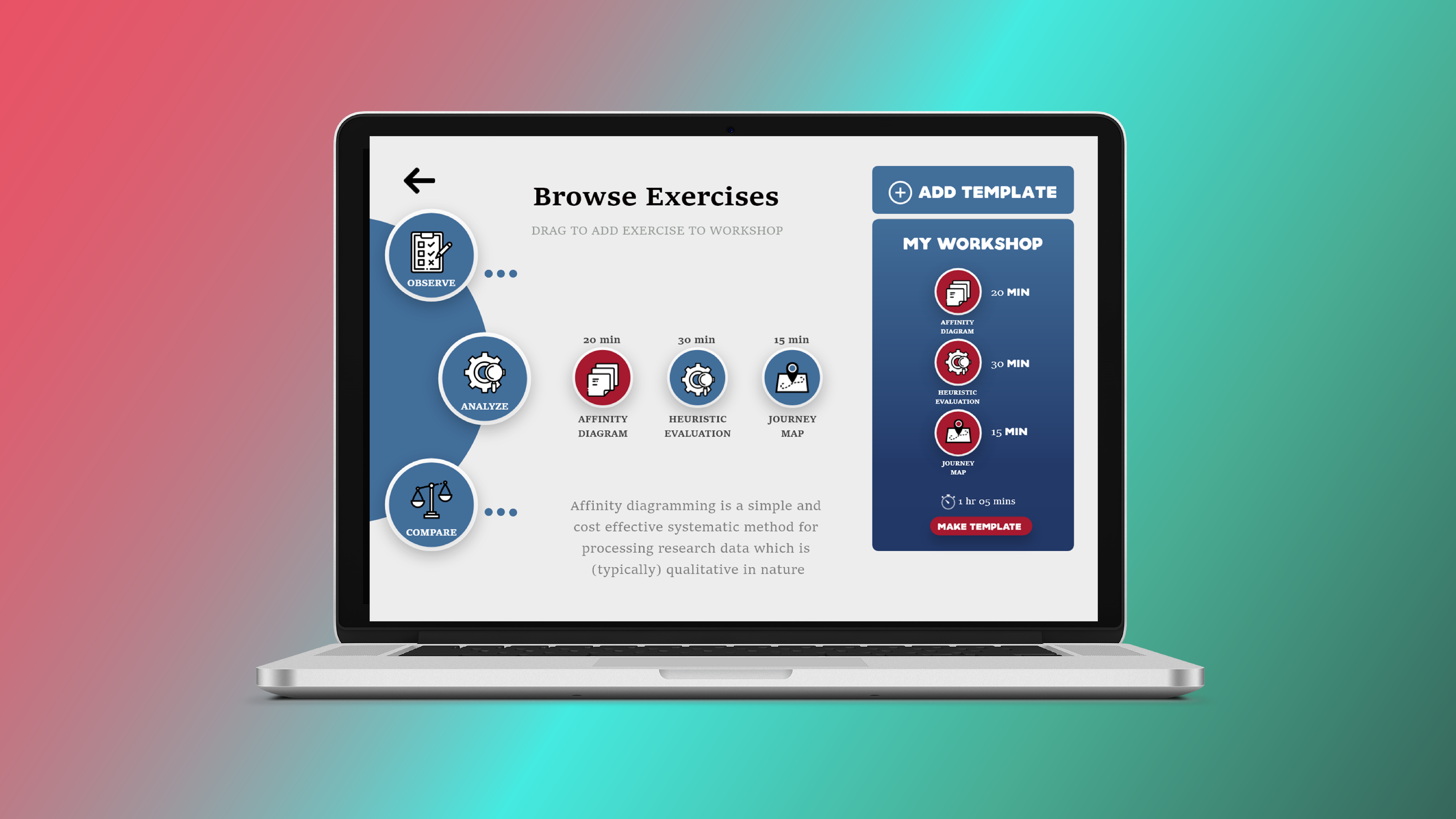
Browse & Add to Workshop
Alternatively, if users select ‘Build Workshop’ instead of ‘Explore,’ they will be taken to this screen. Users can browse the different categories and methods, as well as drag the methods over to the ‘My Workshop’ container. Users can add templates to their workshop and see how long this workshop will typically take to conduct.
My Workshop
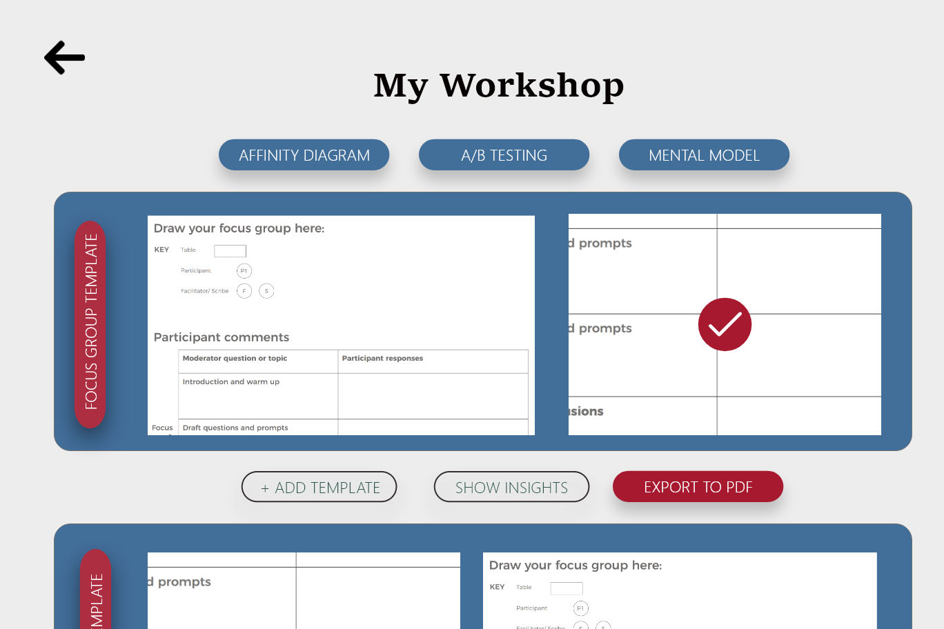
Clicking the ‘Make Template’ button on the ‘My Workshop’ container will bring the user to this page. This screen presents a list of the workshop activities that you have gathered while exploring the toolkit. The user can see every template in a list and has the option to export them as a PDF.

Insights
If the user selects the ‘Show Insights’ button on the ‘My Workshop’ screen, they will be taken to this screen. Here, they can see how their workshop is structured. Users can see which functions their workshop focuses on, as well as what percentage of time is spent on each category.

Details
Similar to how previous sketches are structured, the Details screen includes a short description of the method, an exercise that can be used for a workshop activity, and a template that can be downloaded for entering data or to be used as a worksheet.